Peer Voltmann - IT Freelancer 06.04.2025
Using PowerBI to leverage your valueable LeanIX Data
Data Quality = Hard work
Keeping up a high data quality in a collaborative tool like LeanIX is a challenging process. As the information to be updated is usually spread out on a diverse range of people it involves a lot of communication and setting of guidelines. Maintaining data quality in SAP LeanIX is a reccuring activity to constantly be done if changes occur. The bigger the company and the data being handled in the Enterprise Architect Management (EAM) Tool the bigger the effort to keep the data up to date.
Of course the reason for implementing LeanIX is never to just maintain the data and to keep updating it. It is about the valuable insights we can get from the data stored there. It is about the possibility to plan diverse approaches and transformations. It is about maintaining an overview of the complex (IT-)Architecture of one's company.
Challenges of LeanIX Reporting Capabilites
Looking at LeanIX for the first time I was amazed by the UI. It is quite intuitive and well modernly designed. Despite the design when digging a bit deeper into the reporting section there were (as of now - 2025) some limitations I came across.
When implementing LeanIX at one of my former clients we faced multiple challenges in LeanIX Reporting Capabilities.
There were requests for tables which should include data from multiple fact sheet types. This was not possible to create.
The graphical reports and dashboards are amazing for certain use cases but at some level of complexity in the requirement they could not display our needed use cases.
Using a reporting tool for reporting
Therefore I came up with a different approach and introduced a tool that was created exactly for that purpose: PowerBI. Microsoft PowerBI is a Reporting Tool which allows to create reports with a large amount of flexibility. Flexibility regarding design and calculations.
Of course the key for good reporting is to have high-quality data. If the data quality in LeanIX itself, the data source, is questionable and not trust-worthy then PowerBI can only display this exact data. That's why this where I start with my clients. LeanIX offers various approaches to achieve a high data quality and combining these with data quality reports in PowerBI achieved the best results.
How to do LeanIX + PowerBI
LeanIX offers a standard connector called oData which allows transferring data in a structured way from LeanIX to PowerBI.
As a brief summary, the connector transfers Saved Searches from the Inventory in LeanIX into tables in PowerBI. There a data model adjusted to the use-case can be created. Then the data analyst is free to create which ever reports are helpful for the company. LeanIX offers a great manual regarding the technical process.
(https://docs-eam.leanix.net/docs/odata-for-powerbi-and-tableau)
The cherry on top is the fact that the reports can even be displayed in the UI of LeanIX via IFrame. Therefore the users will still only have to use one software and one UI.
The hard work should be rewarded
Using PowerBI + LeanIX makes sure that the time-consuming process of maintaining data quality is being rewarded with valuable insights. But not only that, another great Use-Case for PowerBI Reports is tracking data quality. As seen in the example report below you can track inconsistencies in the data. In the Demo-Report below this was having an EOL-Date after 2026 but having the TIME-Assessment on "Eliminate". Depending on who inputed the data this might start an important discussion between different stakeholders (e.g. Application Manager & Enterprise Architect). In the end I believe that is what reporting should be able to deliver: valuable insights that decisions or actions can be based on. These actions and decisions will lead to a better and more efficient IT-Landscape. This will not only save costs but also give the opportunity to transform quicker in an ever changing environment.
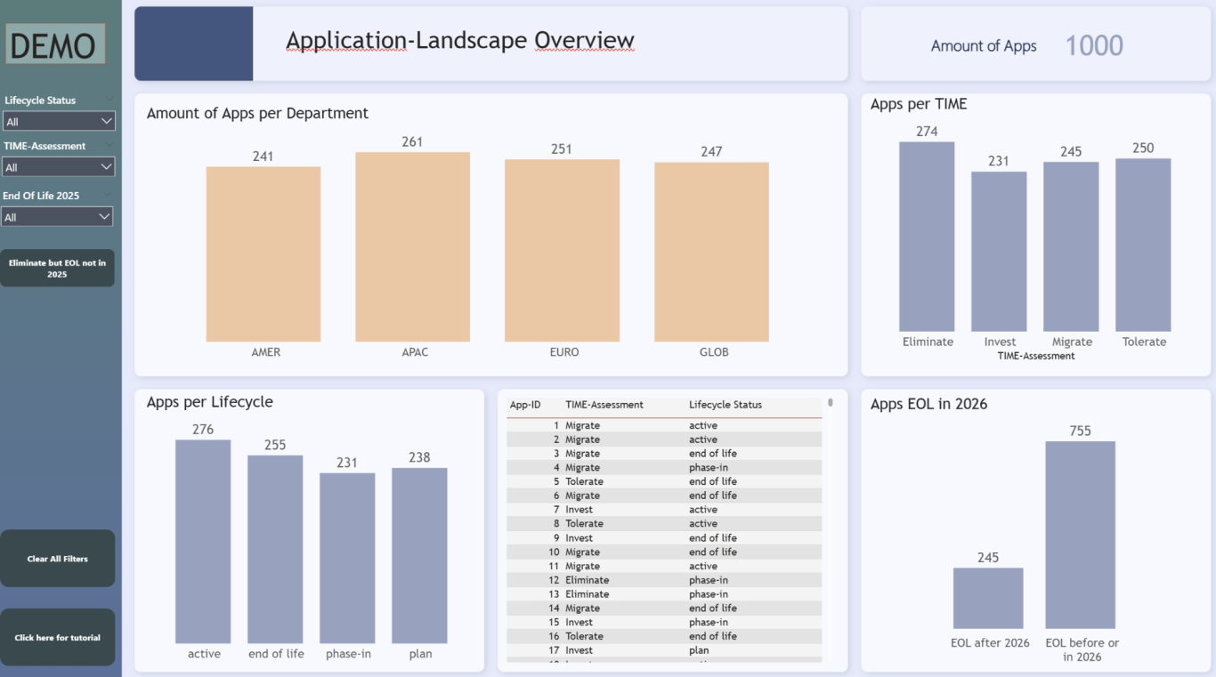

The same report filtered for Apps that have an End Of Life Date after 2026 with a TIME Assessment "Eliminate". This is a classic example of data inconsistency. (Unless the company targets the elimination date of the app after 2026)
TIME Assessment is a method to document what should be done with an application in the future.
This is a Demo Report containing sample data. It is giving an overview of the App Landscape.
The buttons can be configured as desired, just like the filters or the KPIs. The UI, all colors, all shapes are fully adjustable.
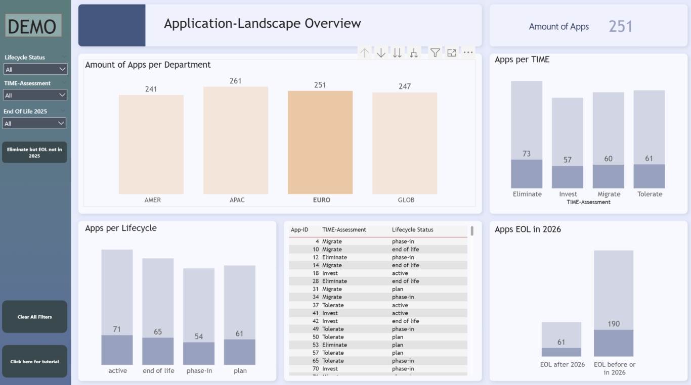
All visuals are by default interactive. Now that I clicked on "Euro", to only filter for the European part of the organisation-hierarchy I am able to see all the values only for Europe. That way it is not necessary to create one report for every department, but just one that can be filtered by everyone specifically regarding their needs.
The small arrows above even give the possibility to "Drill-Through" the hierarchy data and filter for whichever level in hierarchy is needed.
If you want to know more or are interested in
trying this approach, feel free to contact me.

Peer Voltmann
Projektmanager & Data Analyst
© Urheberrecht. Alle Rechte vorbehalten.
Wir benötigen Ihre Zustimmung zum Laden der Übersetzungen
Wir nutzen einen Drittanbieter-Service, um den Inhalt der Website zu übersetzen, der möglicherweise Daten über Ihre Aktivitäten sammelt. Bitte überprüfen Sie die Details in der Datenschutzerklärung und akzeptieren Sie den Dienst, um die Übersetzungen zu sehen.